Home Renovation: New Kitchen Layout

This week started off with a quick trip to NYC (& an awesome hip-hop yoga class). I came back to find the insulation up in the house.
In other news, I’m excited to share I have finalized my kitchen addition design plans. I included a few photos and the floorplan of what the old kitchen looked like so you can get an idea of how big a deal this will be for the house. Goodbye leaky dishwasher.
Old Kitchen

Floor Plan

new kitchen floorplan
A totally clean slate!! Right? Nope. If there is one thing I've learned in a renovation you cannot have it all. I had to make some design decisions and trade offs, but overall I'm excited with where it landed!
For those of you interested in the trade-offs keep reading. I'm also sharing a sneak peak of some of the pretty details I'm considering.
Layout
This is obviously the hardest part. A nearly clean slate but also realities in window and door placement and...in my case size. My kitchen is 11x13 ft. It will be such an upgrade from the old kitchen. With this layout the island had to turn a certain way and I had to do more cabinets that I wanted. I struggled the most with the windows in the kitchen room. I love windows and natural light, and all the modern kitchens these days seem to break up wall cabinets with some nice window space. In the end, I decided to forgo windows on the western wall for privacy and more storage.

I’m going for a classic white and bright kitchen with a transitional feel to fit with the 1920s home.

A few big design decisions—
Cabinets To The Ceiling Or Not?
Cabinets going all the way to the ceiling or not feels like the kitchen debate of all time after the marble for the countertops discussion. I debated this one a ton! With nearly 9 feet ceilings, cabinets to the ceiling were $$ but a big 10 inch soffit above it wasn't the look I was going for either. While I think the soffit here looks nice, this kitchen is much more open than mine.
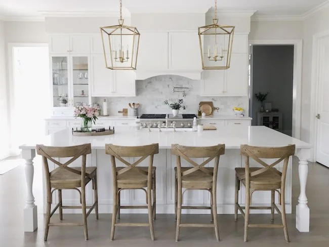
I decided to leave the space above the cabinets open and take the hood all the way to the ceiling. This one I am a little nervous about. Fingers crossed this looks as good in our space as it does in this kitchen!

For the hood style, I decided to go with a custom wood hood. This look felt less ‘kitcheny’ for the open floor plan and will put more emphasis on the pendants over the island. I wanted to put a trim detail all around the bottom of the hood, but with flat front cabinet doors (I decided against iframe due to cost and flat fronts have more space), putting a trim all around the bottom of the hood wouldn’t work. You wouldn't be able to open the doors.

I love this style from Studio McGee—the added piece of wood and trim on the front of the hood gives it a nice detailed look but will still allow the cabinets doors to open.

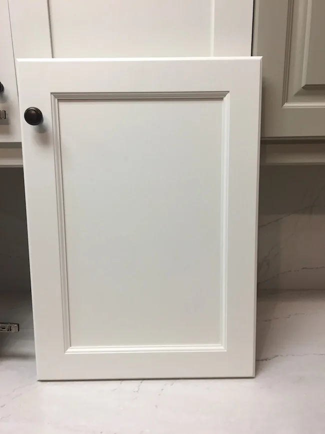
It’s crazy how many decisions have to be made in the kitchen. They feel more permanent and become a main feature of the house. So for the cabinet style, I wanted one that felt like it fit with the house’s era. I picked a shaker style door with a beaded detailing on the inside to give it a more custom feel.
For the paint, I debated the white kitchen vs. colorful kitchen. Of course right when I was designing the kitchen everyone is talking about colorful kitchens are in and white kitchens are out! I just can’t get over a white kitchen. It’s so classic. I’m deciding between Simply White and White Dove - left to right below - they are pretty similar.


Hardware, countertops and backsplash are the next big things to tackle. Here are the style I'm thinking about!
Quartz countertops like London Gray and Calacatta Nuvo

I really love the honed London Gray. It had a more gray tone and even looked white against these white cabinets.

For the hardware, I’m looking at a mix of bin pulls and knobs.

A textured backsplash like a glazed subway tile.


new kitchen design
You’ll have to use your imagination because the island and x-front cabinet doors aren’t shown in this version. Overall, I'm so happy and can't wait to see it in real life!
